DESIGN DIRECTOR : HSIAO YUAN KUO / 郭孝淵
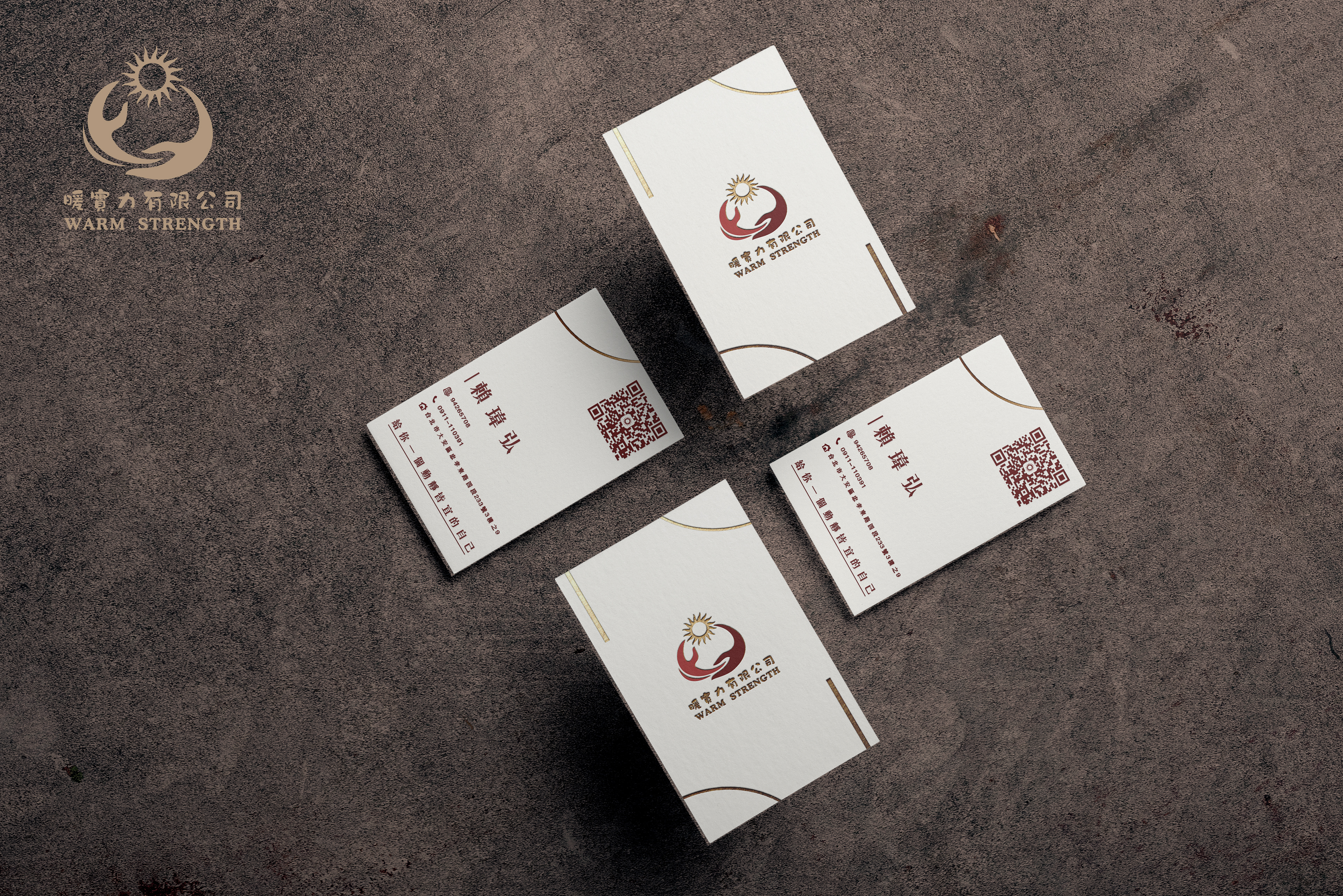
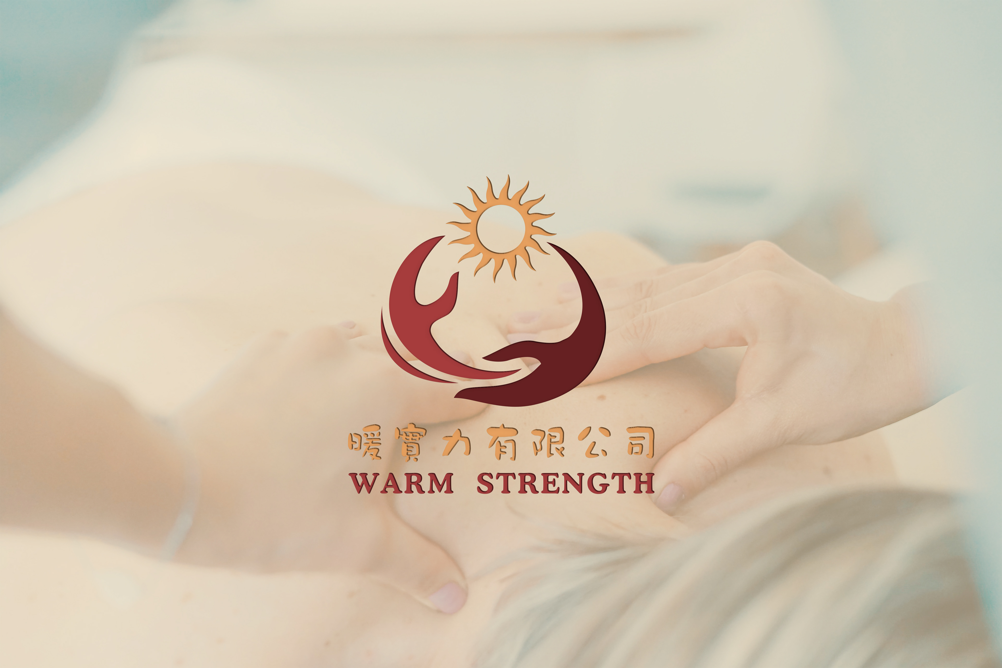
/暖實力有限公司 - WARM STREGTH
統編: 94269708
電話: 0911-110391
地址: 台北市大安區忠孝東路四段233號三樓之9
電話: 0911-110391
地址: 台北市大安區忠孝東路四段233號三樓之9
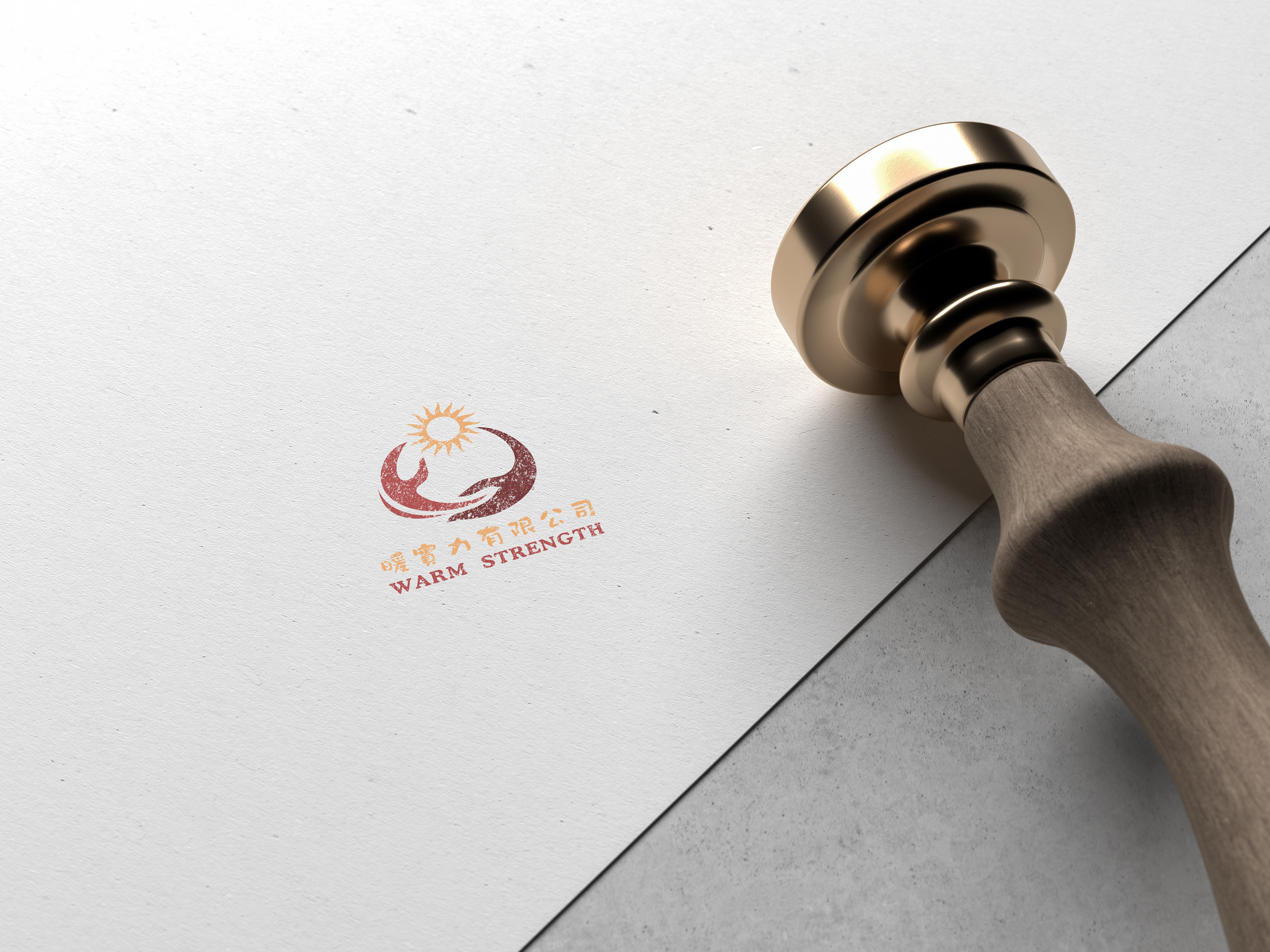
LOGO設計
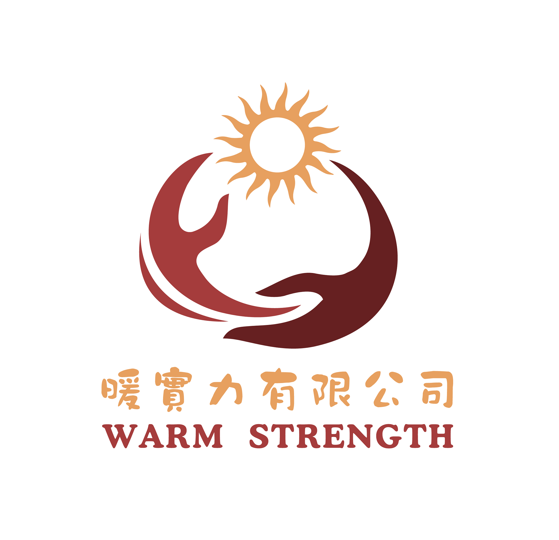
此Logo用抽象化圖形來表達整體品牌的理念。 透過雙手順時針選轉,象徵病患透過物理治療師溫暖的巧手,都能將痠痛和問題往對(RIGHT)的方向發展,並得以見效! 同 時為病患的心理生成光明、溫暖的太陽。而雙手也代表治療 的技巧和關懷,而太陽象徵著康復和新生。順時針方向的線條增加了動感,強調了治療的過程。從另個角度看,也會把它抽象的象徵成左手指天空,而右手環抱擁護著希望。 整體設計簡潔現代,強調治療的正面效果,鼓勵人們有物理治療問題,都可以找此品牌,皆能獲得新 的希望和健康。
This logo utilizes abstract graphics to convey the core concept of the brand. By clockwise rotation of two hands, it symbolizes how patients, through the warm and skillful hands of physical therapists, can direct their discomfort and issues in the RIGHT direction, leading to effective results! Simultaneously, it fosters a bright and warm sun in the hearts of patients. The two hands also symbolize the skills and care involved in therapy, while the sun signifies recovery and rejuvenation. The clockwise lines add a sense of dynamism, emphasizing the treatment process. From another perspective, it can be abstractly interpreted as the left hand pointing to the sky while the right hand embraces hope.
The overall design is sleek and modern, highlighting the positive impact of therapy and encouraging people with physical therapy needs to turn to this brand, ensuring they can find new hope and improved health.
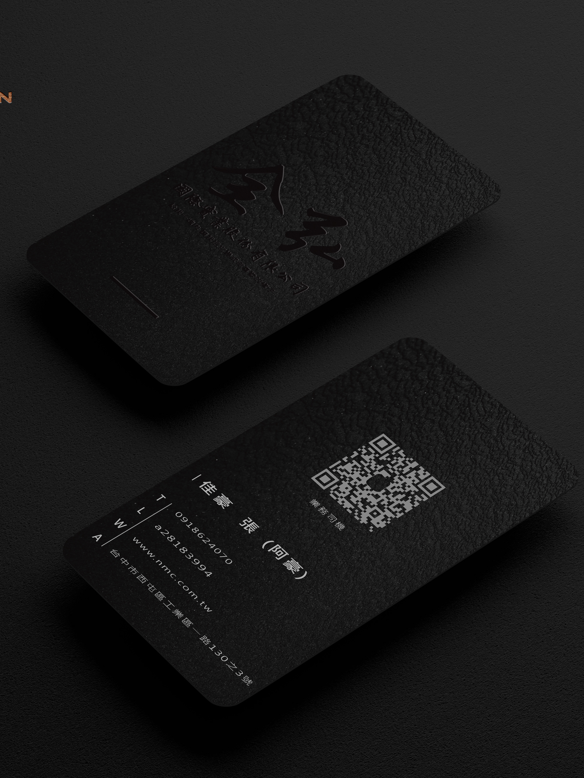
名片設計